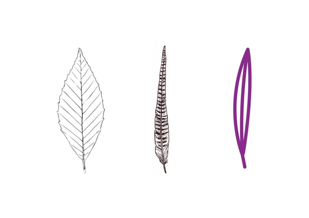
When creating the logo for the Nové Bydlení Letohrad project, I took into account the local context of the Nad Bažantnicí site and the main values of the project – ecological, modern and community housing. The goal was to design a visual symbol that combines nature, protection and a sense of home.
The dominant element of the logo is the motif of a pheasant feather connected to a tree leaf, which visually represents a connection with nature, harmony and sustainability. This shape also evokes softness, balance and protection – qualities that describe the character of the project and its orientation towards peaceful living close to nature.
The color palette of the logo is based on natural shades – lush green and soft earthy tones – which enhance the ecological dimension of the project and create the impression of natural harmony. The typography is chosen to appear modern, yet friendly and easy to read, which underlines the openness and credibility of the brand.
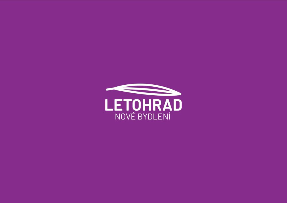
The logo has become a key visual element of the entire project identity and is used across all communication materials – from the website to promotional materials, print materials and visualizations.